
Quadra Island Golf Course
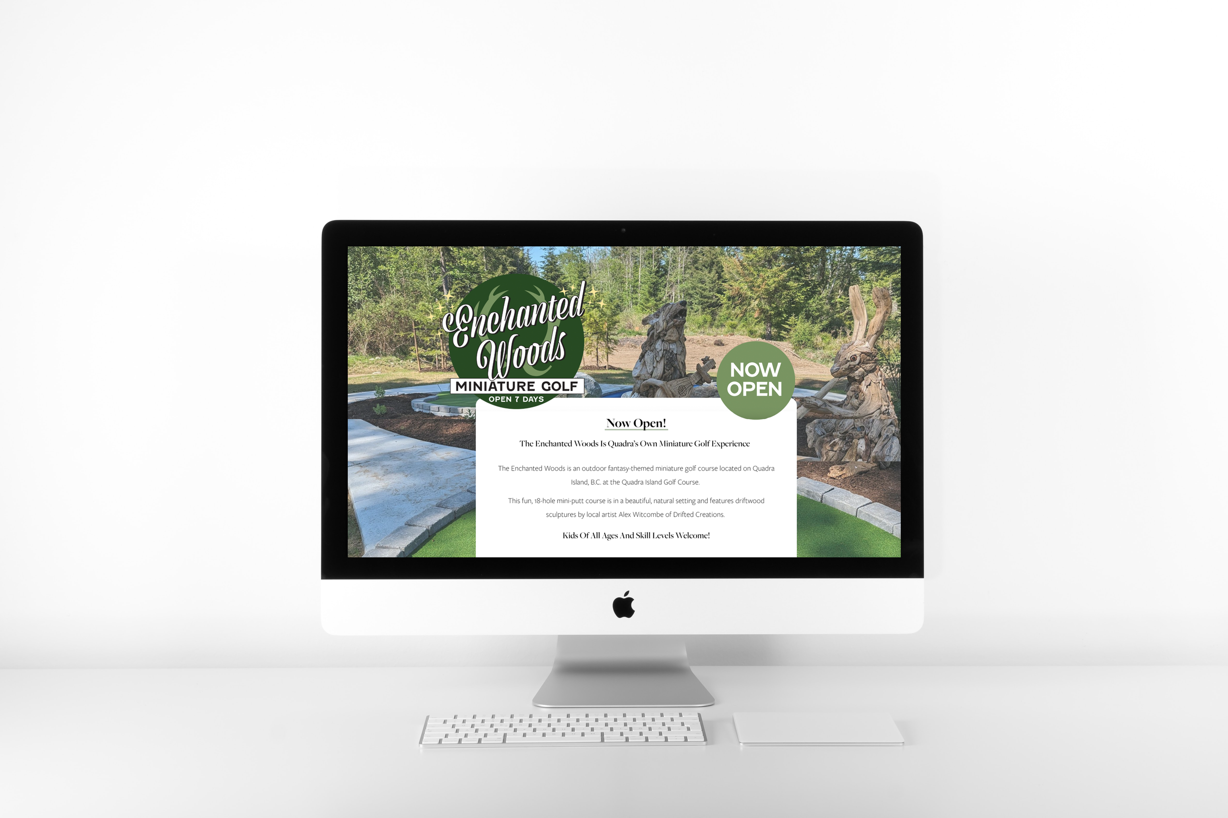
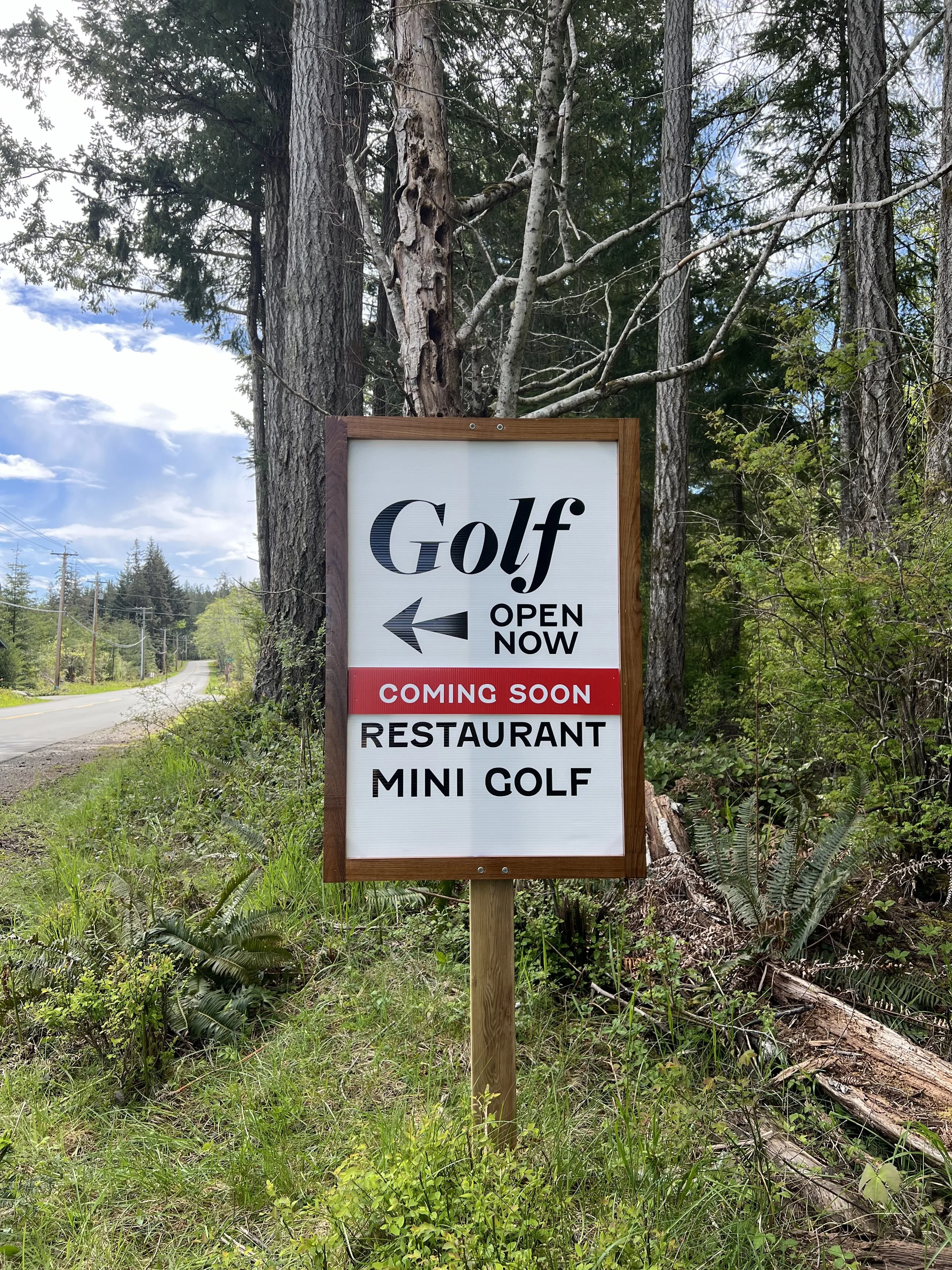
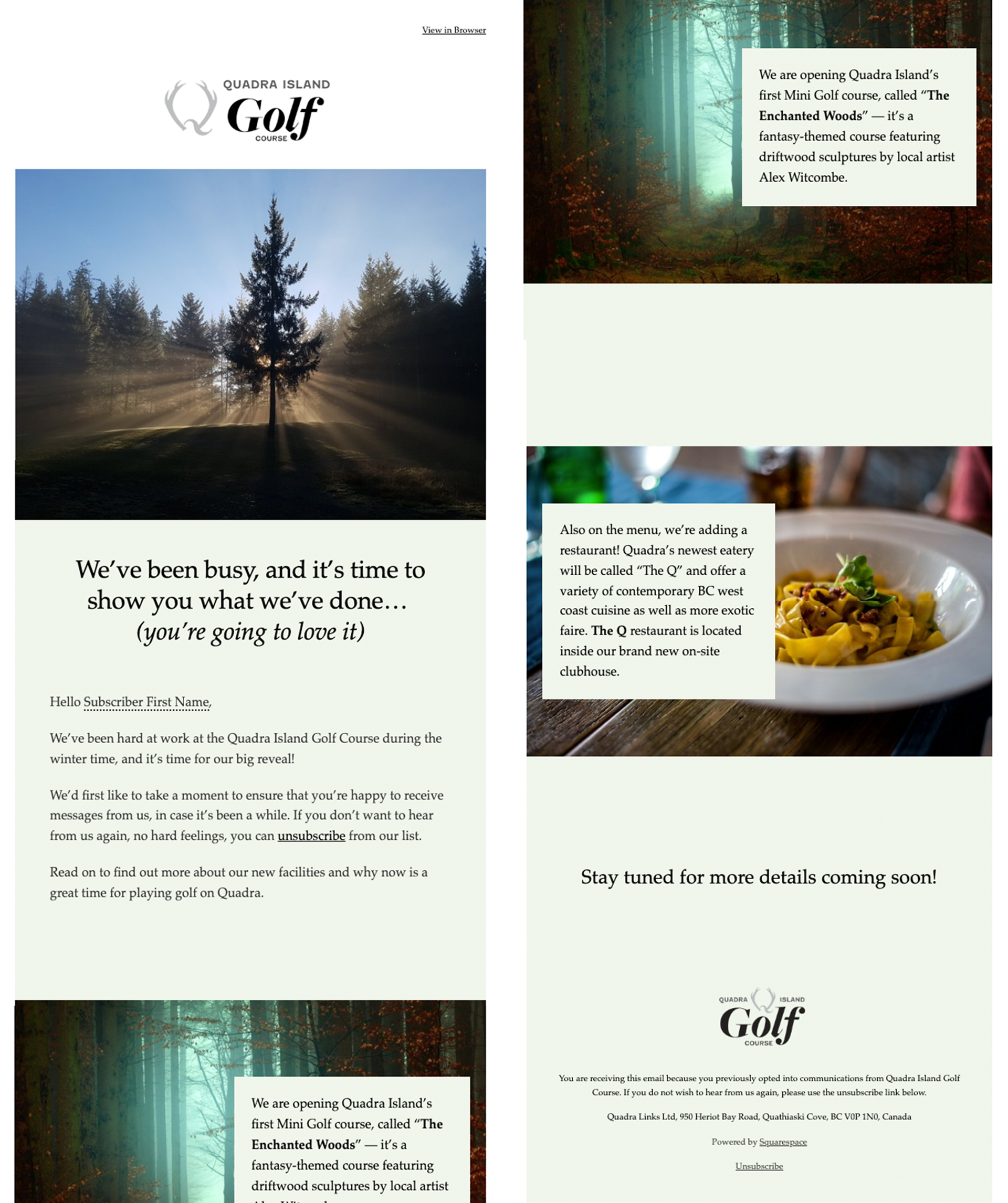
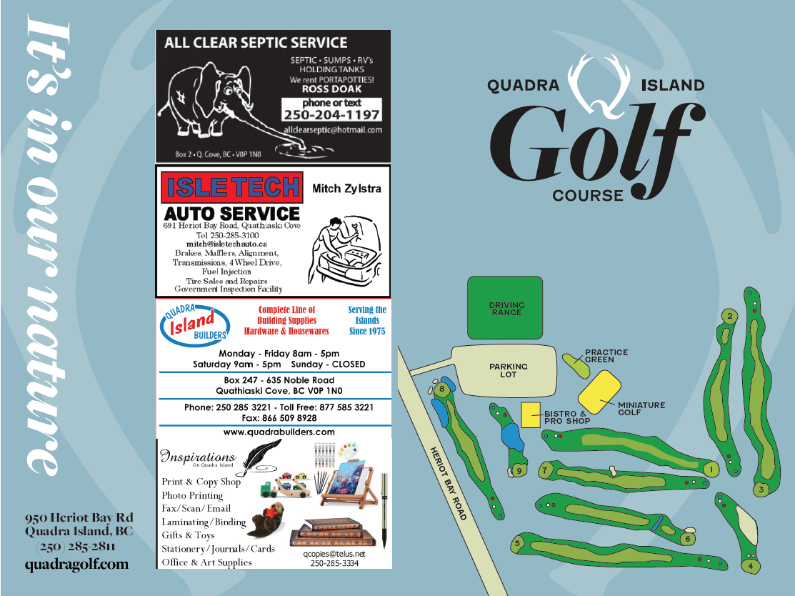
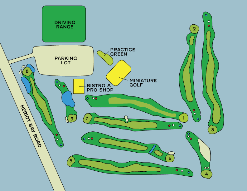
Quadra Island Golf Course was celebrating 10 years in business, and decided to expand to add a restaurant and mini golf course. Although they had been in business for quite a long time, they had a very DIY approach to their look, resulting in an inconsistent visual identity. Faced with increased local competition from other golf courses on Vancouver Island, they wanted to attract more members and affluent Quadra Island tourists to their course.


“Your Logo design for the Enchanted Woods Is Iconic.”
— Scott McCartney, Mini Golf Course Developer at The Golf Park Company
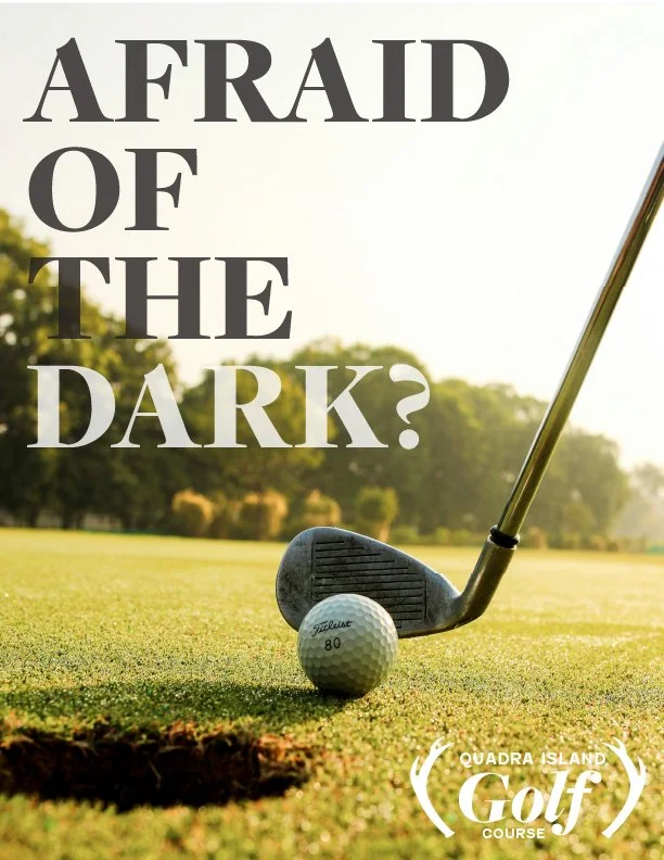


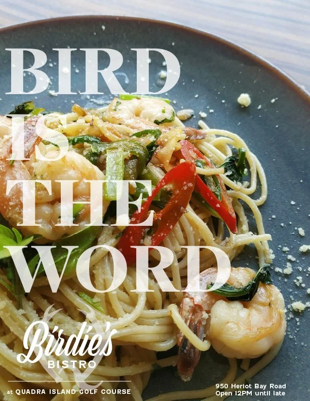
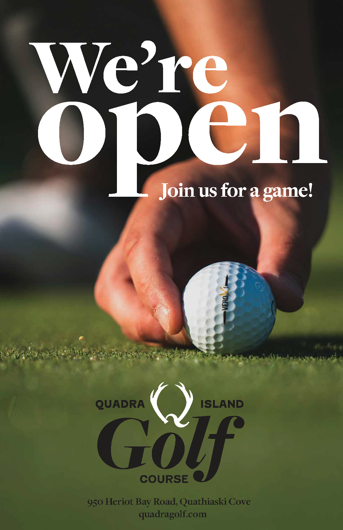
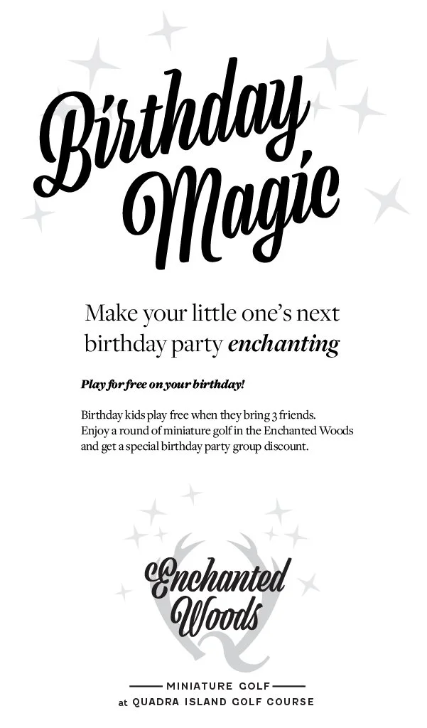
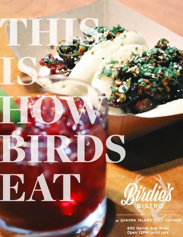

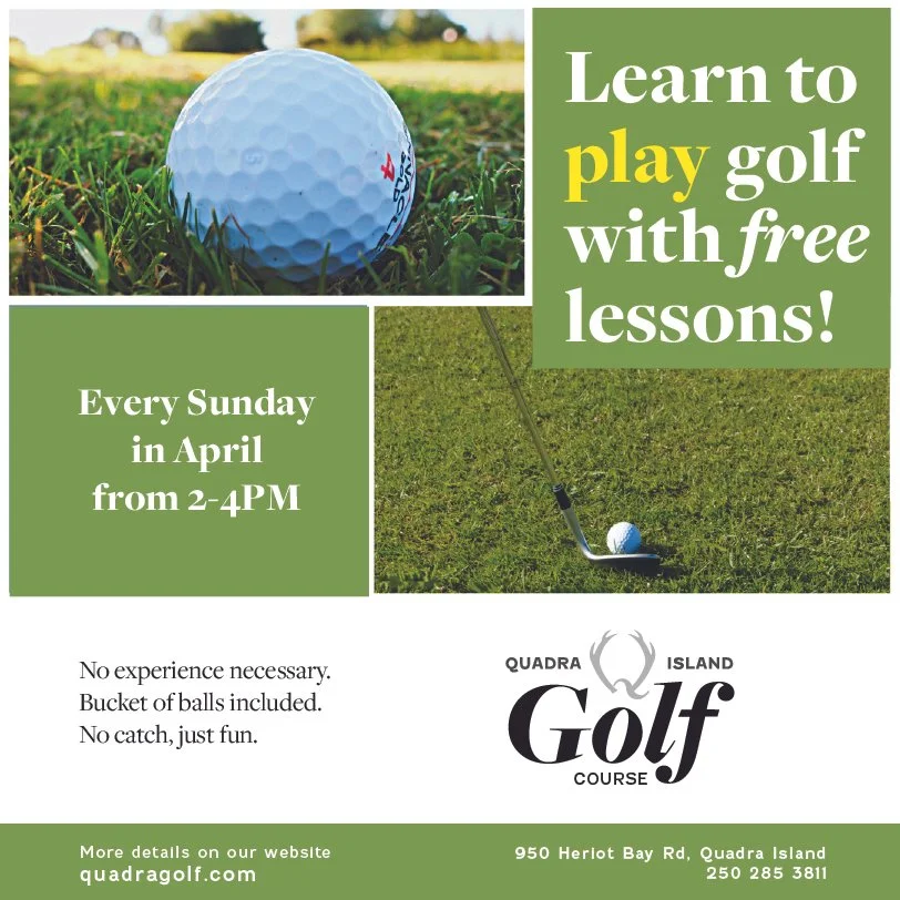
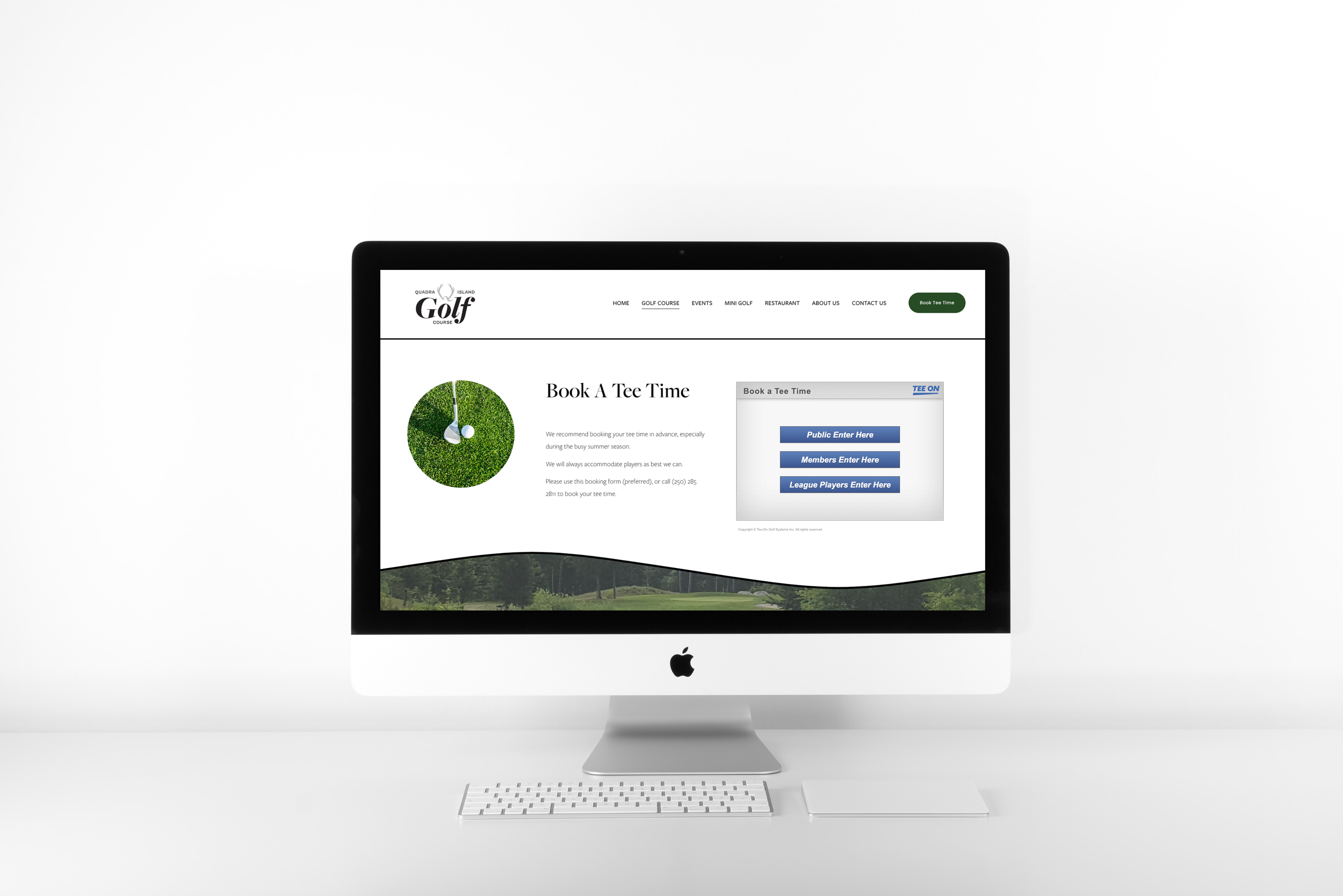
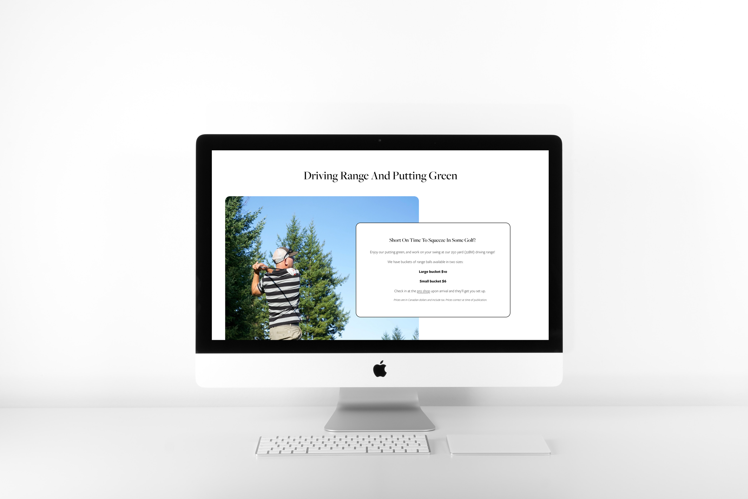
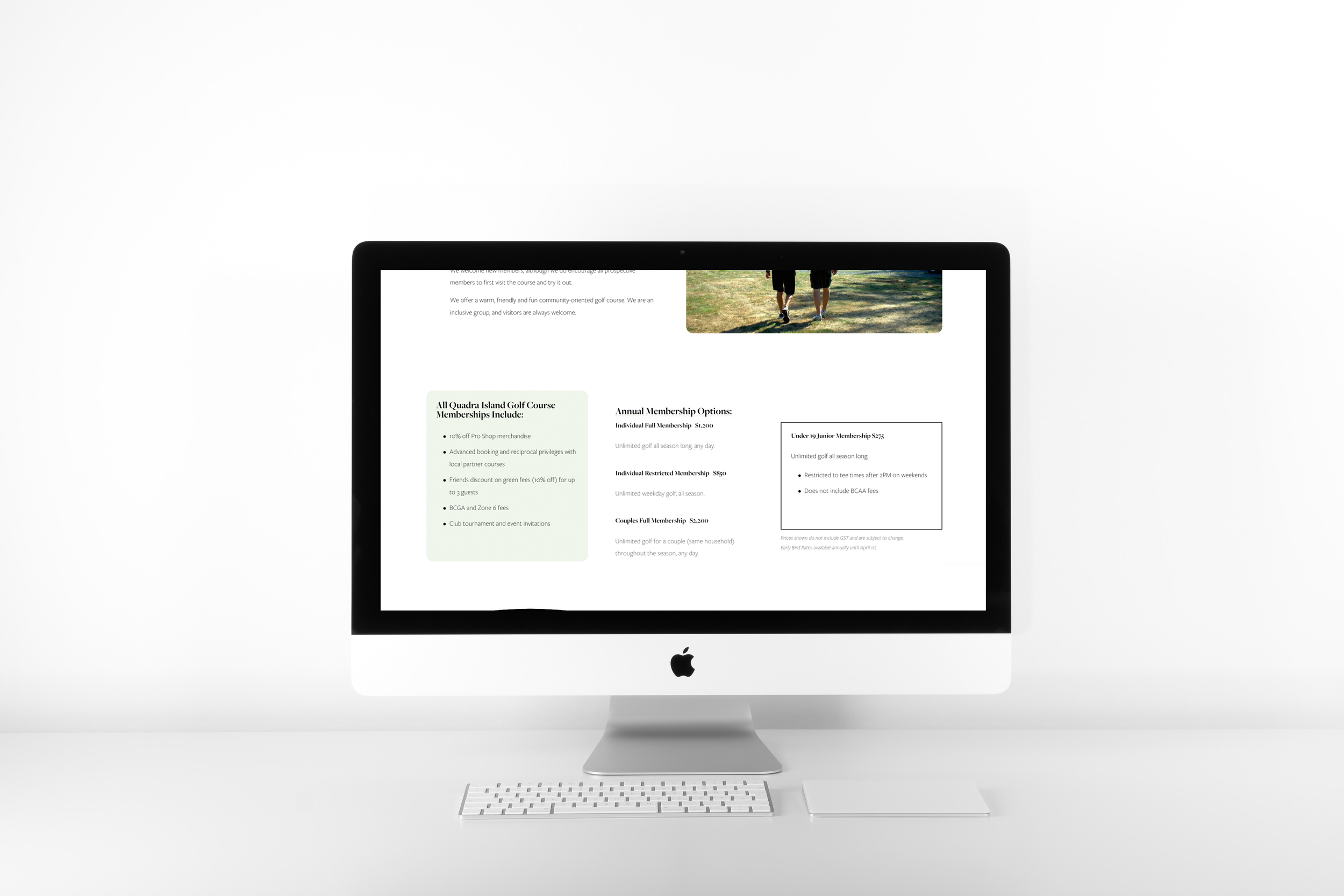
We created a cohesive multi-brand identity system, incorporating a family of brands for their businesses, and revamped their outdated and DIY-looking website to be elegant and attract the desired demographic of tourists. We also designed many ads and promotions to promote their business in print and online.
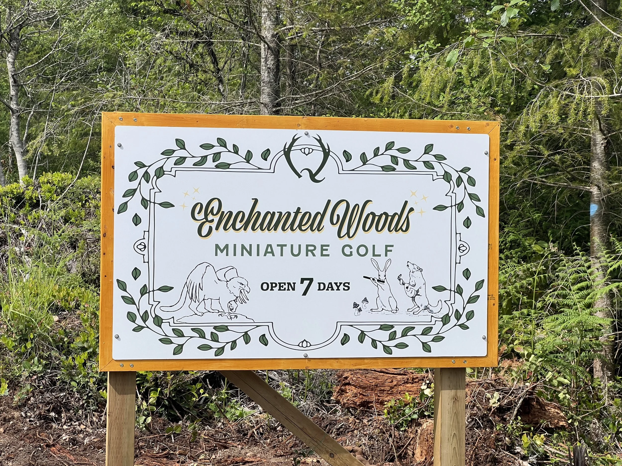
Multi-Brand Visual Identity
The Quadra Island Golf Course was built by passionate volunteers who all pulled together to make the golf course happen. However, their existing branding was almost non-existent, they had graphics created in Microsoft Word on their merch, and a different logo on the sign at the entrance. It didn’t clearly say anything about them, leading to a situation where they had very little awareness among tourists and often locals had the wrong idea, which made it difficult to grow their business. While building a restaurant and a mini golf course, it was the right time for them to create a consistent and cohesive brand identity for their golf course, and the newly created businesses in their family of brands.
A Brand Family
We created a multi-brand visual identity for them to use, these brands look harmonious when used together and share some similarities, yet are each distinctive on their own. We built out a brand family and usage guidelines to set them up for success in the future.
We used a combination of three typefaces in the creation of these logos: Freight, Fenwick and Viktor Script. The unifying element is the horns, inspired by laurels given to winners, and shaped like the antlers of the local deer who frequent the course. The swash of the Q is a wave, which is a nod to the beautiful island setting the golf course enjoys.
Unfortunately, there was a change in management and they have radically changed the work that we did so it’s no longer a representation of our work on this project.